
For an exercise in data visualization, I was given the below table. The goal is to visualize this data in a way that is clear, concise, and engaging. The table reveals an organization’s client portfolio, tiered in some meaningful way and sliced by revenue.
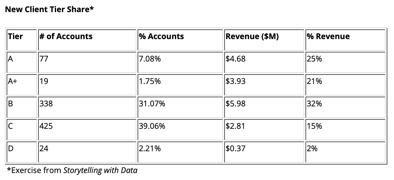
The prompt told me to “create an effective visualization.” I took issue with this prompt because the data is already effectively visualized! A table is a form of data visualization and—might I add—one of the most useful tools in a data communicator’s toolbox.
In my current role as a marketing consultant, I provide many different types of reports to my clients; all reports are mostly visualized in some way. The most common request is a table. A table is pragmatic. It serves multiple audiences. Every professional has a different level of comfortability with data visualization, and tables meet in the middle. They are comfortable for “spreadsheet people” and they are acceptable to “chart people.” Tables are a place where everyone can sit.
All this to say, I looked at the provided table and gave it a chef’s kiss. Why break what isn’t broken?

I wanted to fulfill the assignment, however, so I decided to give it a go. I did not abandon the table, which you know that I love. Instead, I decided to improve it by building upon it.
I took inspiration from Airtable, a hybrid spreadsheet database and project management tool. Airtable is Google Sheets on steroids. You can easily create custom views, label status fields with colors, collaborate and tag colleagues, and even develop custom codes and formulas. One of my favorite Airtable capabilities, however, is embedding images and attachments into rows.
So in the spirit of Airtable (but shamelessly created in Google Sheets), I’ve recreated the table with a few bells and whistles. See my results below.
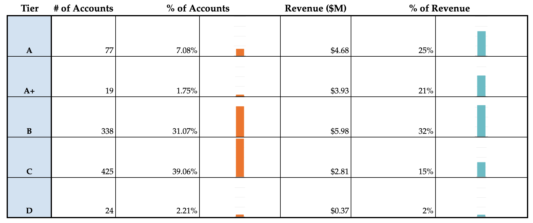
The table is similar in structure: Tier in column A and supporting data in the adjacent columns. However, as you can see, I added a column next to “% of Accounts” and a column next to “% of Revenue.” These columns offer an extra spice of data visualization in the form of bar charts. The bar charts offer what I call “the quick reference effect.” (Otherwise known as, “I have a meeting in three minutes and I need some insight NOW.”)
The original table, which primarily served straightforward data, now offers the viewer the ability to make assumptions and draw conclusions that perhaps weren’t as easy to make as before. The data, of course, is all the same. It just has more flavor.
I initially tried to build this table using a pie chart (see below), but I did not enjoy the results. Taking pieces out of a pie chart without having the whole pie to reference felt disorienting and incomplete.

The bar chart table, which I’m referring to as Table 2.0, allows for easy data comparison across the row. The viewer can also compare the bar charts within different rows, which helps to analyze profitability and promote prioritization.
After working with the data and building my Table 2.0, my conclusions are many. I’ll quickly summarize the salient points below:
- Tier D accounts should be immediately discontinued. Though we are missing data related to cost and hours/account, we can safely assume that Tier D accounts take as much time to service as Tiers A – C. Perhaps this is why they are labeled “D.”
- Tier B is the company’s sweet spot. If sales volume is a concern, then Tier B should be prioritized.
- Tier C should be phased out. Though the volume is high, the revenue doesn’t match the effort. The company would do well to realign on Tiers A, A+ and B and discontinue service to Tiers C and D.
- The % of Accounts data is incomplete (i.e., does not add up to 100%). This could be due to a data sourcing error or to the intentional removal of accounts with zero revenue.
Overall, I enjoyed this exercise. Putting data to work is fun and useful. For my money, it is hard to beat a table. They are foundational, accessible and flexible. And best of all, much like a real table, they offer a starting point for conversation.
Header photo by Adrien Olichon on Unsplash
