
Like most of us, I was glued to news websites and social media as COVID-19 swept across the earth. I obsessively tracked daily infections, death totals, hospitalization rates, and recovery rates. Some news organizations presented pandemic data better than others, but I began to grow weary of the confusing and sometimes contradictory data visualizations. Additionally, pandemic data was often presented alongside news headlines, which were usually political and opinion-heavy.
I needed facts, not hot takes.
Eventually, I discovered Domo’s Coronavirus Tracker (the Tracker). I use Domo for data visualization at work, so I was already familiar with the platform. I randomly searched for it one day and was thrilled to find that they had developed their own pandemic reporting page. I quickly checked to see where they were gathering their data, and I was pleased with what I found. According to Domo, their data is “gathered every 10 minutes from credible sources, including WHO, CDC, Johns Hopkins University, Worldometer, IHME, The COVID Tracking Project, FRED, The New York Times, the Wikipedia compilation of world testing, SafeGraph, Foursquare, Thumbtack, SBA, Apple, Google, and data from AWS Data Exchange” (2021).
What I like most about the Tracker is how it distills a massive, overwhelming amount of information into a concise story. What is the story Domo is telling? I would argue it is twofold: 1) Where we are now (with the virus) and 2) Where we are heading (using predictive models).
One of Domo’s best user interface benefits is how it allows you to dive into the data. You can select fields and the rest of the reports will filter based on what you have selected. You can also change the time frame, the location, and more.
For most people, I think, especially people unfamiliar with Domo, I suspect the Tracker might feel overwhelming. There is a ton of data flowing into these reports. Like all data visualization tools, if you visualize too much, the data starts to blend together and it can be all too easy to get lost in the weeds. The story loses focus and the narrative becomes numbers. I think Domo does a decent job of providing headers to different sections to keep ideas and themes organized, but as with everything, there’s still a little room for improvement. For example, I would remove the “Economic Relief” section from the primary page. The data is definitely interesting and useful, but if you are just looking for the latest COVID numbers then these reports are just noise.

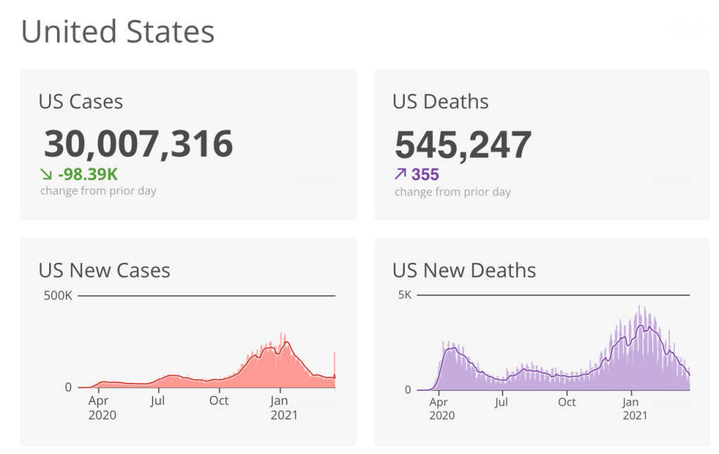
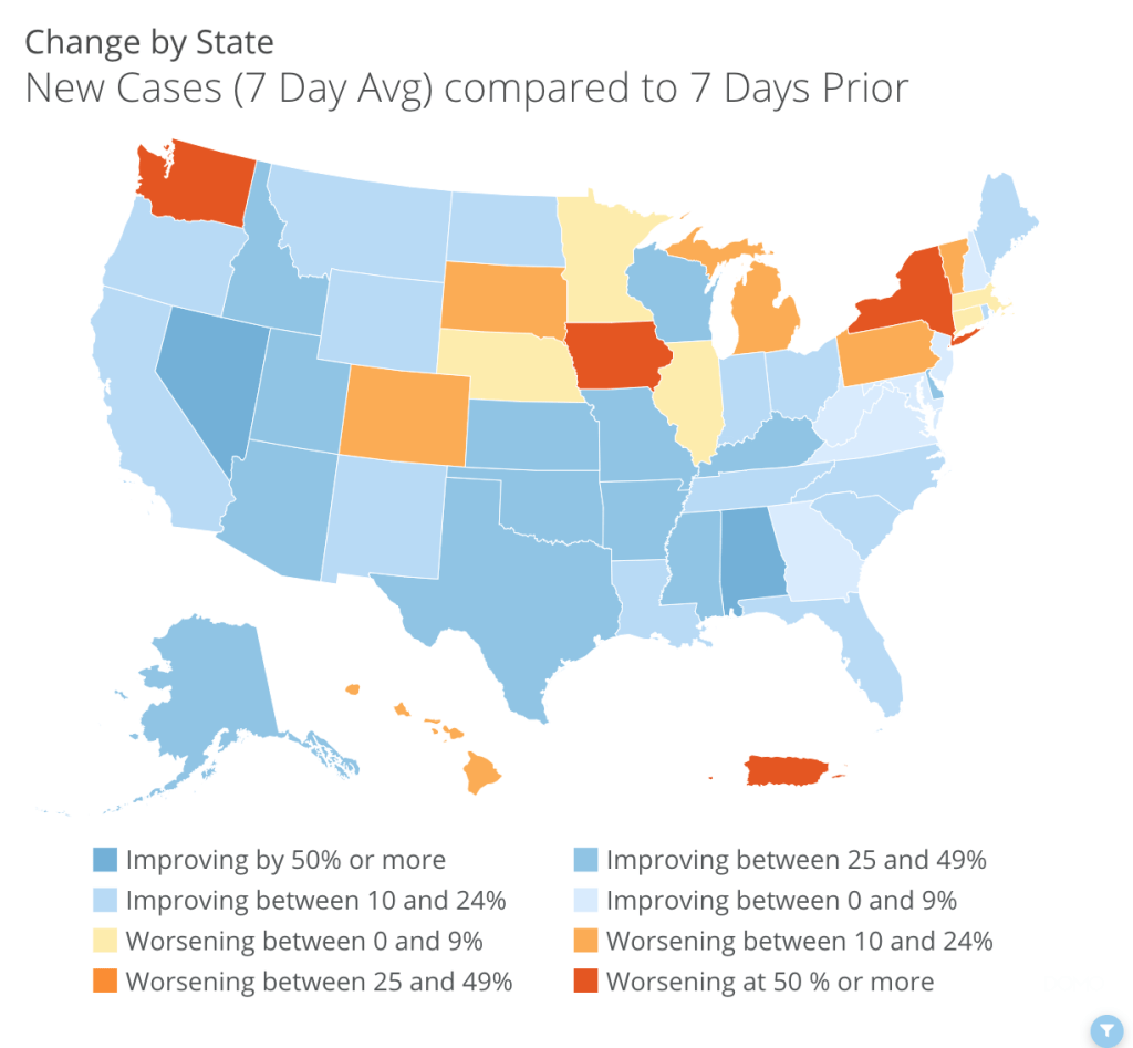
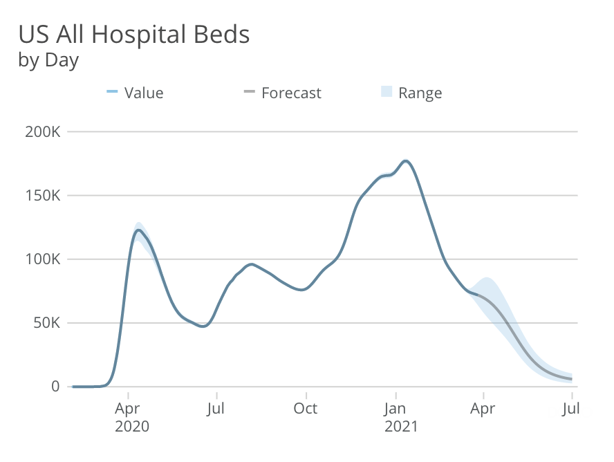
My ideal capability would be to “favorite” certain reports and create my own dashboard with it. For example, I really only consistently look at a handful of reports: US Cases, US Deaths, New Cases (Change in Seven-Day Average by State), US All Hospital Beds, and Days Until Projected Peak Hospitalizations. It would be great if I could have my own view of just these reports with the option of visiting the primary Domo page if I wanted more. Additionally, it would be incredible if you could “pre-save” filters, such as Washington State or Spokane County.
Otherwise, Domo’s Tracker remains my go-to source for all things COVID-19. It really is a fantastic tool. If anything, it has been my source of truth in an uncertain time, as well as a source of comfort and peace, knowing that the truth is still out there. You just have to look a little harder to find it.
Featured photo by engin akyurt on Unsplash
